Stonewall F.C.
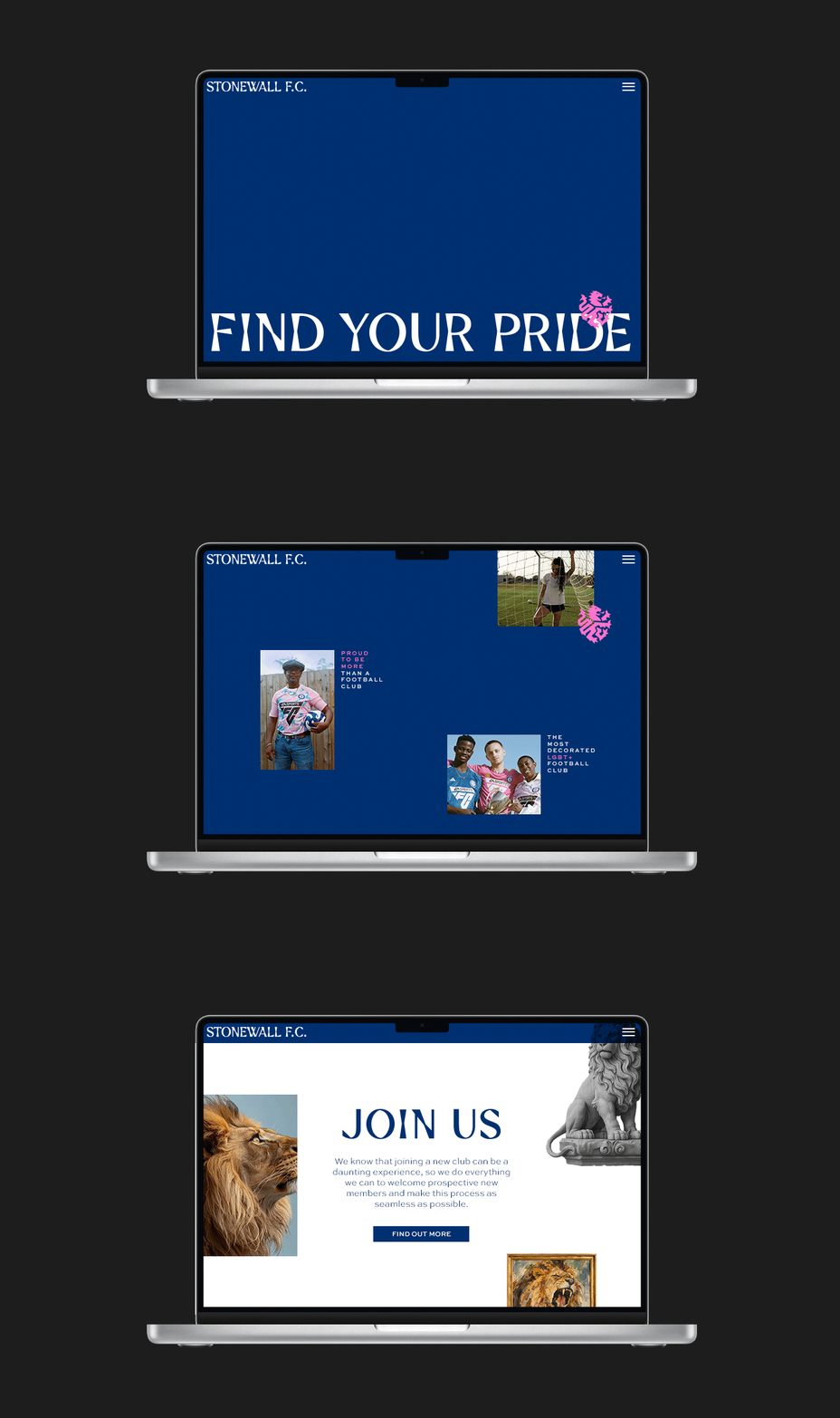
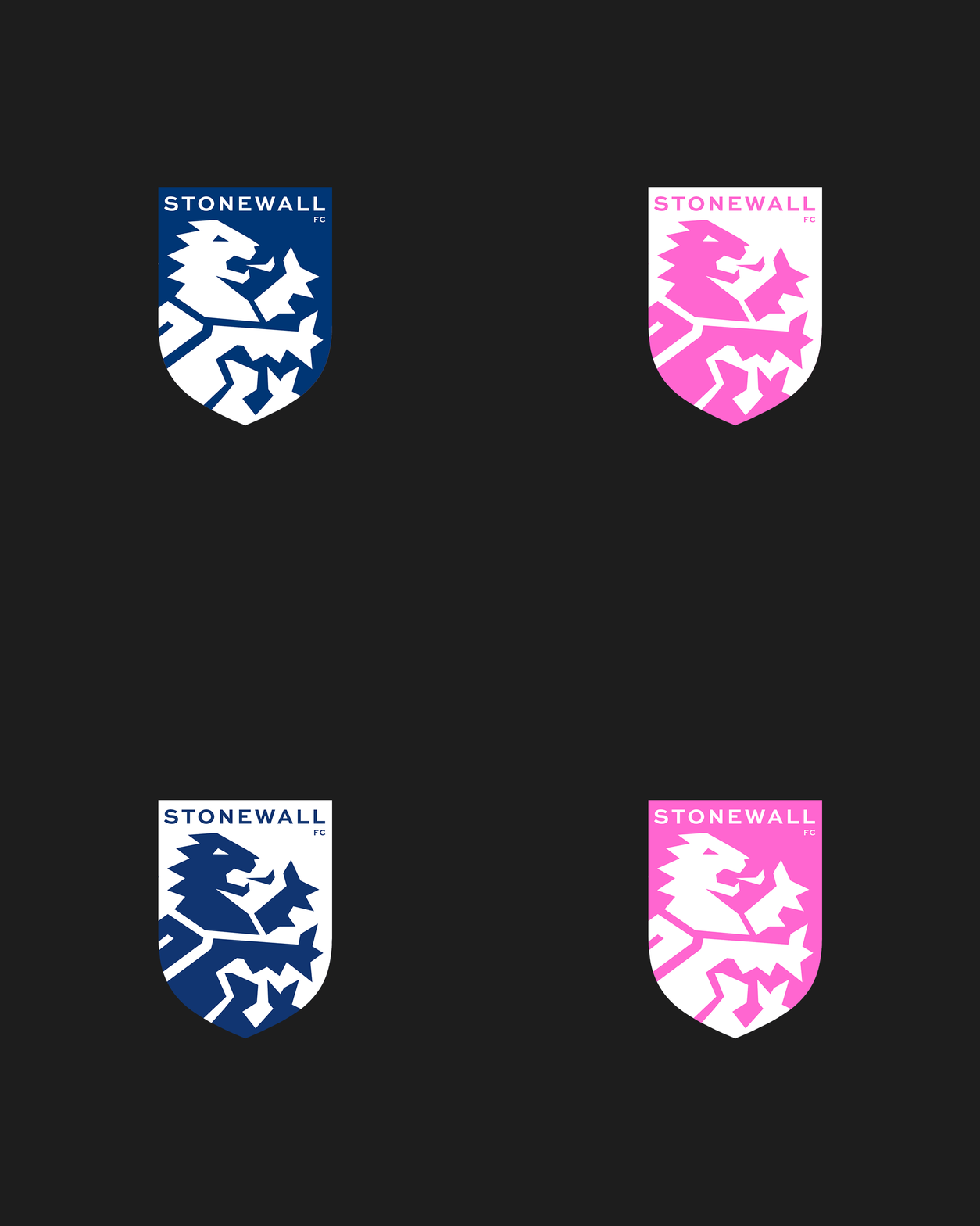
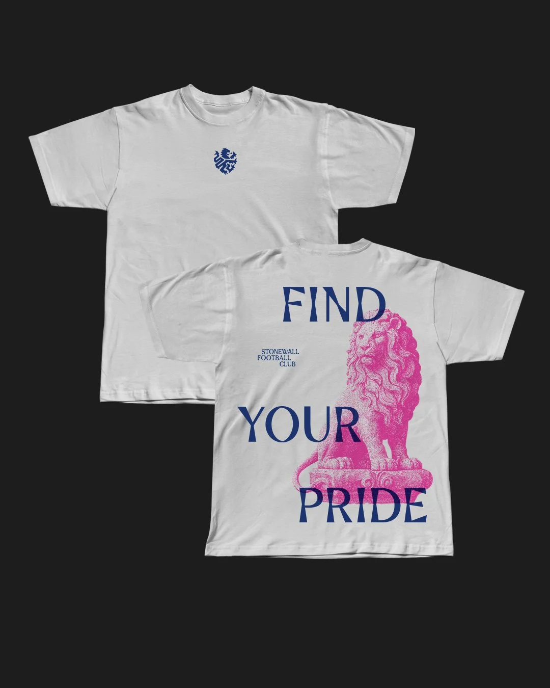
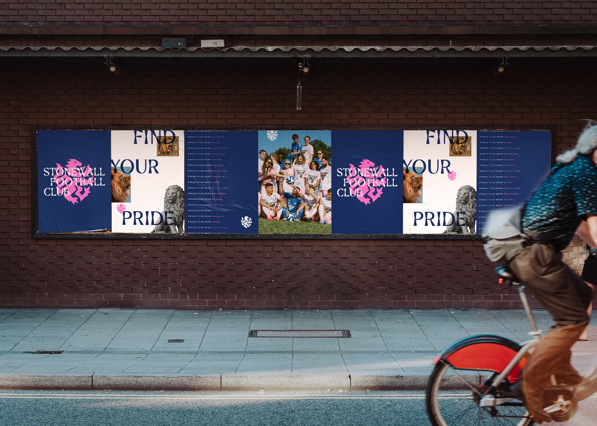
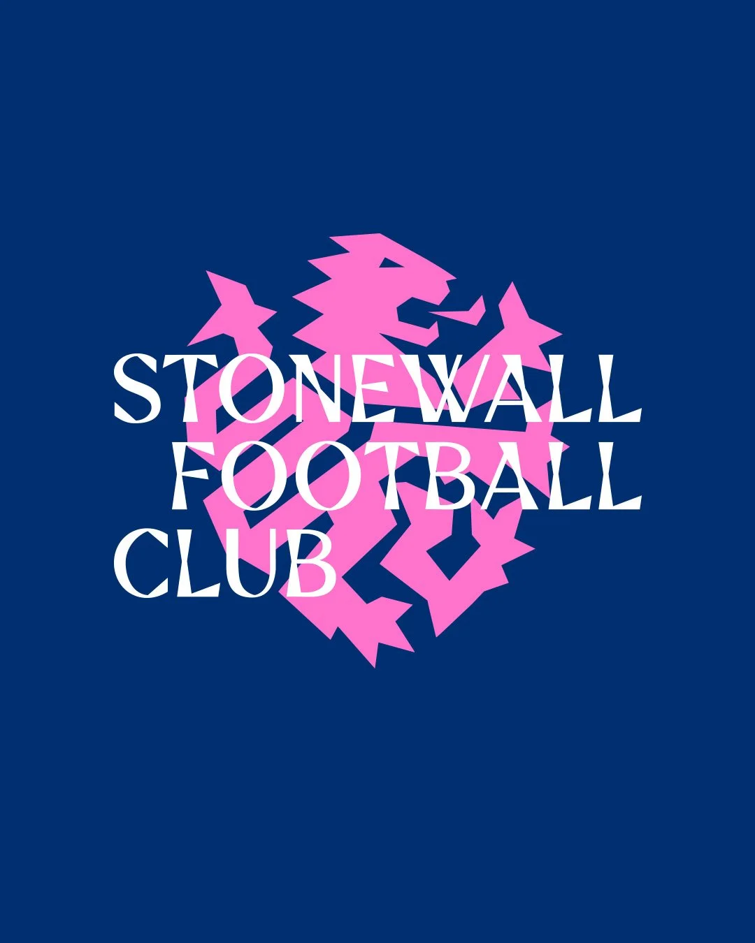
Branding concept for Stonewall F.C. the most decorated LGBTQ football team in Europe. Evolving their current lion based crest but hinting to their nickname The Stones by using stone carvings as inspiration throughout the wider branding.
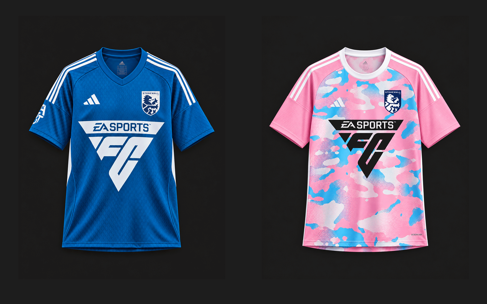
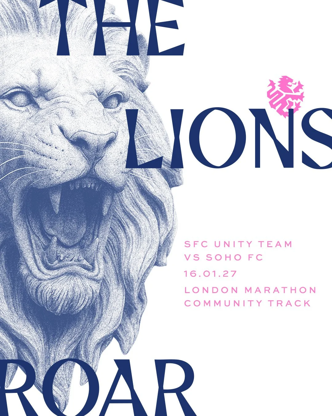
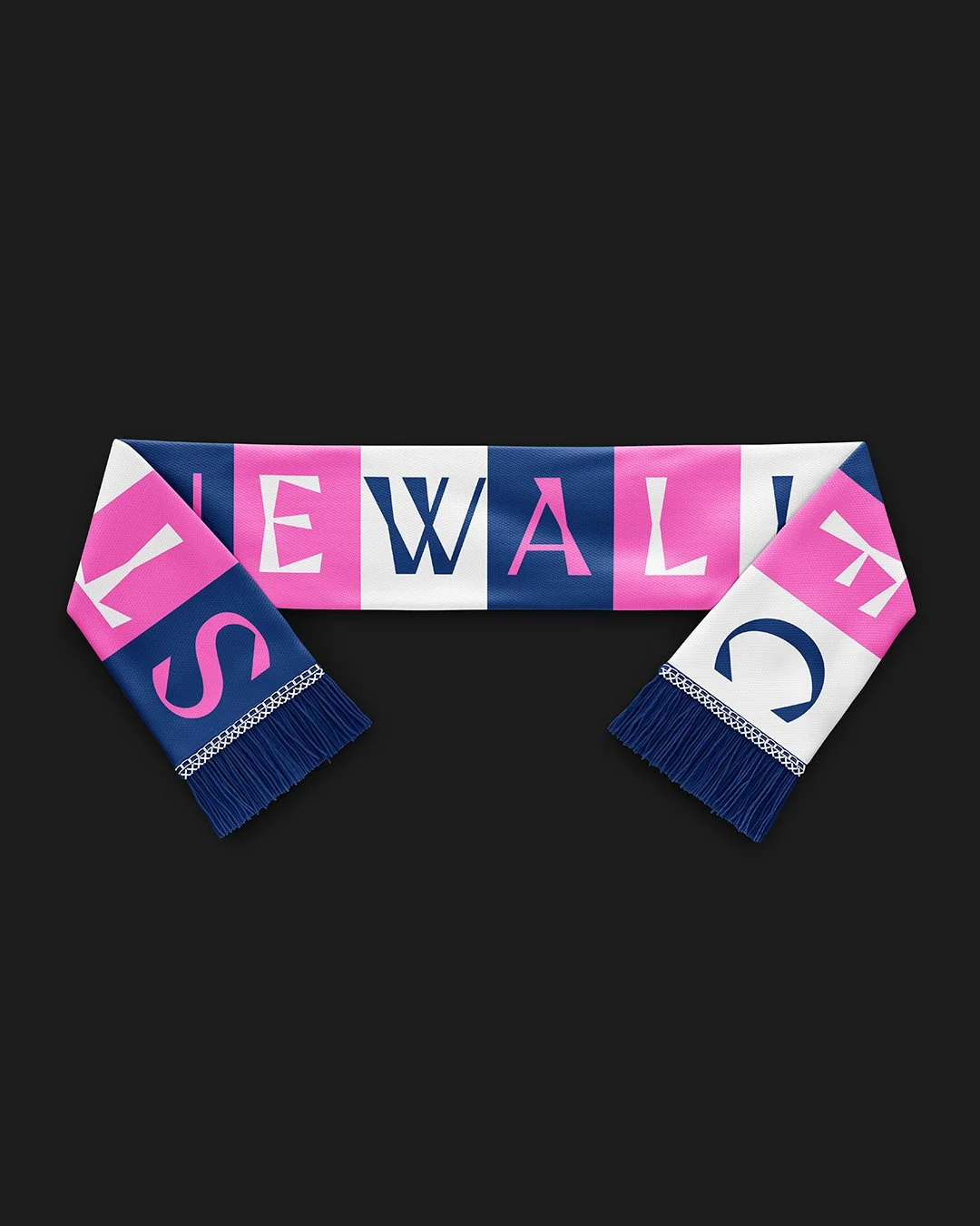
Although founded in 1991 Stonewall F.C. has never had a clear identity. Their crest is a lion but no current players or fans know why and neither their name, or their nickname The Stones, have inspired any part of their visual language. Football is deeply personal, and being a queer club adds a whole new layer to this. The club chairman summed it up perfectly - the teams identity is in turn an important part of all of the players individual identities. So the pressure was on - a dream brief and a huge challenge combined!
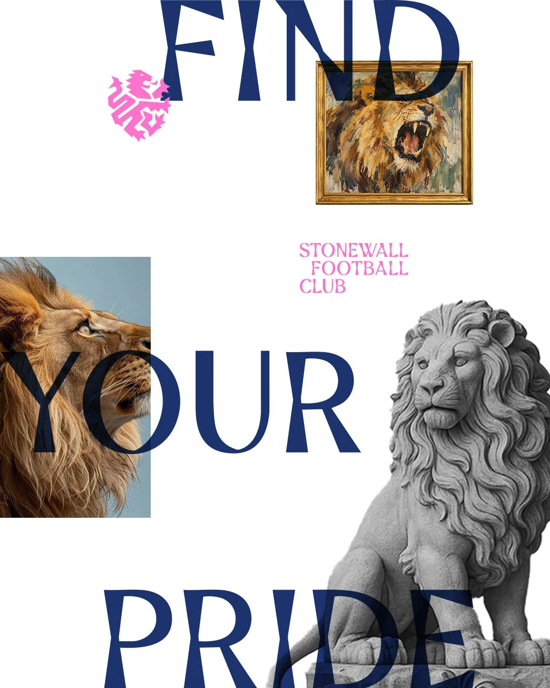
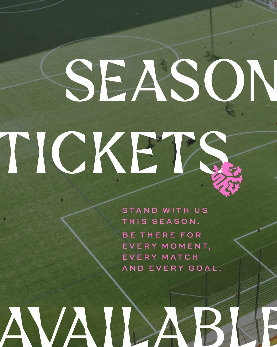
With this in mind I was briefed to design two different concepts - one that evolved the current lion identity and one that explored stones as a visual language - that the committee, players and fans would vote between. In the lion route I wanted to hint at stones to close the gap between the two routes and stone carving felt right. For the typeface I used Faxi from Good Font Foundry which feels somehow modern and as if carved from stone. This, alongside using stone lion sculptures for supporting imagery, felt like it answered both the lion and stones sides of the brief.